Understanding Customer Flow: The Key to Effective Layouts
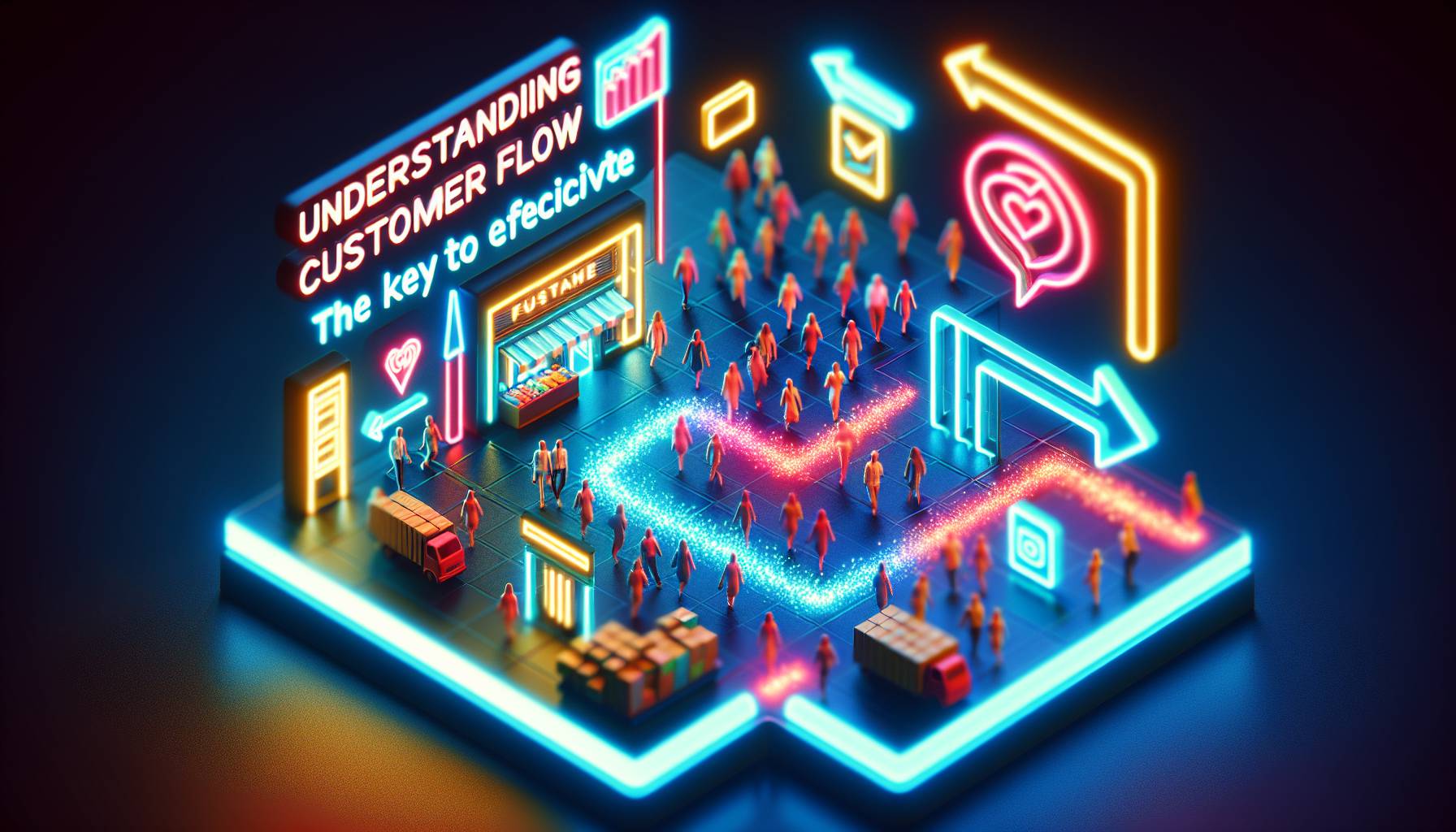
Picture this, you’re walking into a supermarket. The items you need are fairly straightforward, yet somehow, it takes you thirty minutes to find them all. You do find all of them eventually, but you also walk out with things you didn’t think you’d need and end up spending more than you anticipated - which means the layout worked.
The best brick-and-mortar stores are designed in a way that guides customers throughout the store and enables people to explore everything it has to offer. The way I see it, i think customer flow is crucial when it comes to layouts - because it does affect what people end up buying and how much time they spend at the store. Understanding your customers’ shopping behaviour and patterns can rather help you organise your floor accordingly - influencing decision-making and maximising sales without making it look like you're doing exactly that.
For example, a fresh batch of croissants will always greet you at the entrance of a bakery. This is seemingly to ensure the customers are welcomed with warmth and an aromatic smell. In supermarkets, usually dairy items like milk or butter would be at the back of the store so that customers walk by all other products before picking them up.
The customer journey, from entry to check-out should be as seamless as possible - not too rigid with closed shelves and tricky price tags but also not so cluttered that there’s no space left for people to move around freely. It’s essential to understand how people behave while shopping so that their movement can be anticipated and the store can be set up efficiently using data-backed tools like footfall analytics - just like mannequins can show a real-life version of an outfit on display, these tools help analyse real-time customer data so that your store remains updated with changes in consumer behaviour and habits.
The Role of Visual Merchandising in Store Design
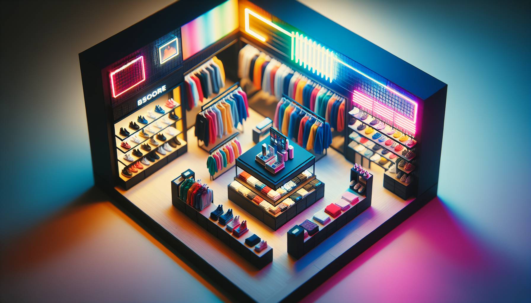
Imagine walking into a store where every shelf is perfectly lined up and symmetrical - it’s like being in a black and white photo, right. Something’s missing. I Suppose some might say it’s not the products or the lack of colour but a little creative chaos that could add life to the store.
That is what visual merchandising does - creating an interesting story with your store. The difference between a store that is visually appealing and one that is not is how people react to your displays. If you have products in fun stacks or in an interesting pattern, people are more likely to move things around, explore and interact with the display. An organised shelf might seem like the more practical choice for easy restocking but if every product is rather stacked on top of each other, how will customers know what goes with what and which products are meant for whom.
This is where visual merchandising comes in handy. Visual merchandising will also help you show customers how products can be used together and which ones work best for their requirements. More or less.
These little snippets of information are often displayed on shelves as signs and info cards which add to the overall aesthetic of the store. And if you’re running low on a certain product or it is yet to be restocked - add more signage letting customers know why that product may be out of stock or when they should expect it next.
It keeps people informed without feeling frustrated about missing out on something they were looking for. Store layouts should also incorporate aisles that are wide enough for two-way traffic and let more than one person look at displays at once. Think about how markets work - the flow of people makes a great difference in how easy it is for shoppers to find what they need without feeling crowded or overwhelmed by choice.
Large stores can benefit from wider aisles while smaller stores may opt for vertical shelving, making use of floor space for wider aisles. Keep these suggestions in mind when planning your store’s layout next time.
Incorporating Technology for Enhanced Customer Experience
There's nothing worse than walking into a store and immediately feeling like you're back in the late 90s. Faded posters, a counter you can barely see over, and a register that looks like it needs two people to operate. Now, imagine if you walked into a store and were greeted by an interactive kiosk that let you browse the catalogue while giving you directions to exactly where the item you're looking for is.
That sounds much more exciting doesn't it. The way technology can enhance customer experience is very different from what it used to be. Remember those annoying billboards that would flash on LCD screens in shopping malls.
Or those escalator railings with advertisements pasted on them. Those were so distracting and I'm glad we've moved away from them. It's now more about convenience than trying to stuff as many products and offers in our faces. Using QR codes for digital catalogues and as payment methods can potentially make shopping so much easier for customers.
Technology like digital screens, VR, or AR can be very useful to customers who are looking for something specific or want to try a product before they purchase it. It can also help reduce operational costs by reducing the amount of staff required for day-to-day activities such as checkout and restocking shelves. Many businesses have also started using motion sensors which help identify when a person is close to something so that an employee can guide them if necessary.
No matter what you choose to do for your store, it's important that any technology you use has been checked and double-checked for its privacy policies. There are still some apprehensions about privacy when it comes to technology, especially with things like facial recognition and automated checkout systems but I think we're moving towards a world where those are no longer going to be issues for too long.
Creating Zones: Balancing Product Accessibility and Aesthetics
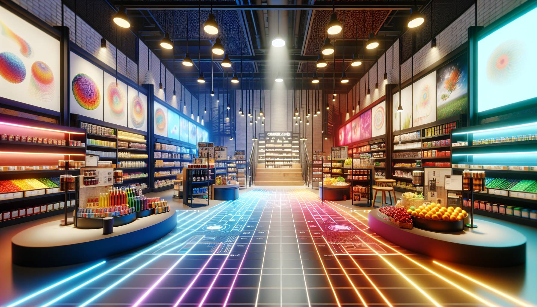
You walk into a fashion store. There are clothes everywhere, but you have no idea where to start and somehow, you feel like you have to check the entire store to find the one thing you need. Nothing is worse than an overwhelming retail experience.
This is quite a bit why creating distinct product zones within your shop, based on categories or price points, helps shoppers navigate the space and discover products that match their needs. But how do you make your store more accessible without compromising on appearance. There’s a fine line between displaying a small selection of high-end apparel as if they were luxury goods, and having all your stock displayed in a way that makes people want to browse and buy.
At the end of the day, it all depends on knowing your customers and understanding what they’re looking for when they enter your store. In my experience, first-time shoppers are occasionally usually more hesitant when faced with expensive-looking items in a retail space.
It can be intimidating. I think placing limited stock on the main floor is usually associated with high prices and exclusivity. Shoppers often feel like there’s an unspoken expectation to buy something if they ask for assistance at stores like these, which is why most people don’t enjoy going into designer boutiques unless they’re actually committed to making a purchase. If you’re not trying to create that perception for your store, then it might be worth looking at different ways you can display your products.
Accessible isn’t synonymous with ugly either - you can still achieve a certain look for your shop by creating visually pleasing displays using shelving units and racks. For brands that want to achieve both accessibility and aesthetics, updating mannequins regularly can help keep things interesting while also giving shoppers inspiration on how they can style certain pieces.
Sustainability in Store Layout: Eco-Friendly Design Practices
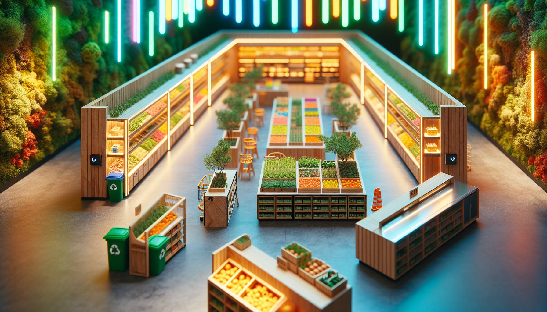
I popped into a clothing store the other day for a look - as you do - and was taken aback by their conscious choice of layout. Aside from the beautiful colour story and clean lines, I noticed they were using recycled wood for their display tables and locally sourced clay for their decor. Was I in love. Yes, but I was also inspired.
Brands are no longer hiding behind pretty clothes and good customer service. They're also putting in the work to establish themselves as ethical, sustainable businesses. Adopting sustainability in store layouts isn’t about checking boxes but rather about reflecting values.
It seems like making choices that reduce the store’s environmental impact, such as investing in high-quality led lighting or recycled glass for mirrors, is a great place to start. Then there's choosing durable, eco-friendly materials such as bamboo or recycled wood, which makes a world of difference. Truthfully, I do have some reservations about where one draws the line with sustainable design. Are brands being honest.
Is there actual intent to make this planet safer. Or is it a well-veiled attempt at greenwashing. It seems like these are questions we'll all have to ask when we're on our next shopping spree.
Ultimately, incorporating sustainability into store layouts goes beyond reducing environmental impact. A well-intentioned approach can relatively set you apart from competitors and show customers you care about much more than making profits.
Case Studies: Successful Store Layouts That Boost Sales
I think about department stores a lot. When you’re surrounded by them, it’s quite hard not to - and they’re easy to get lost in. If you don’t know what I’m talking about, you’ve clearly never visited one or you just have a knack for not getting lost in big places.
And even if you do happen to get stuck, that can potentially work out in your favour too - it’s a win-win for you and the brand, because wandering around means there’s more opportunities to shop. I know that sounds like a stretch but it makes sense when you realise that some of the most successful layouts are allegedly a direct result of brands making it harder for people to leave. Sometimes their best-selling products aren’t right near the entrance - in fact, they’re at the back.
Which means you need to walk by everything else just to find the one thing that brought you here. That’s how luxury stores operate, by centring their most profitable items and making sure they’re what stands out most. Say there’s an entire counter dedicated to fragrances that smells incredible - that was planned. Creating an immersive experience for people takes some effort but it means they can interact with products directly instead of simply purchasing them on display.
The psychological aspect of this is almost never interesting too, because some stores focus more on drawing your attention instead of making navigation difficult. Think supermarkets for example - there’s so much signage and usually even music playing so people are apparently always looking up at something or down at shiny floors. The way I see it, there’s mirrors everywhere too which is both confusing but also intriguing from a design perspective.


